
I was commissioned by writer James Pretlove to design a logo for the website he was putting together. He had a few ideas but had been very attracted to my 'jonathan dredge' logo.
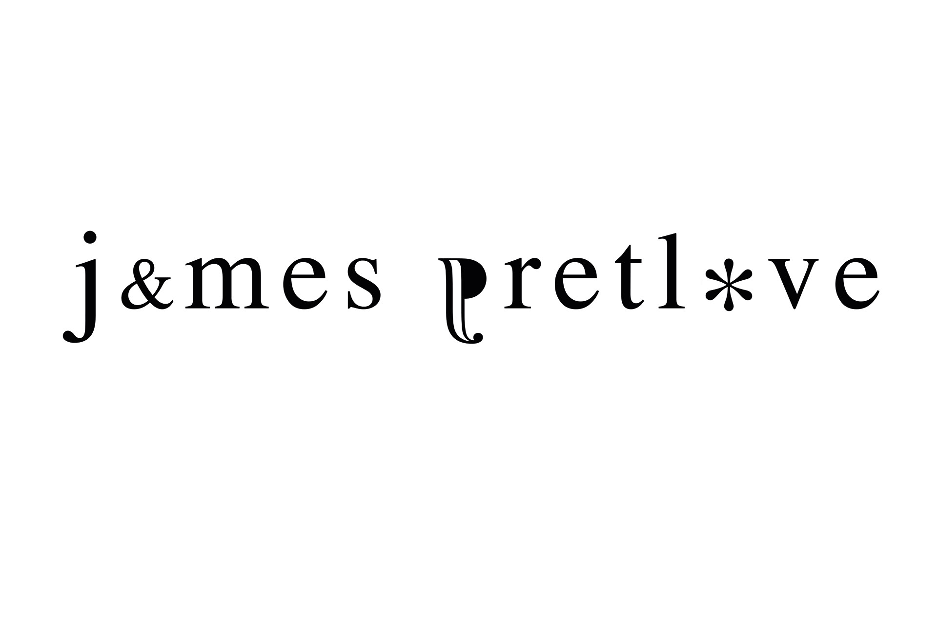

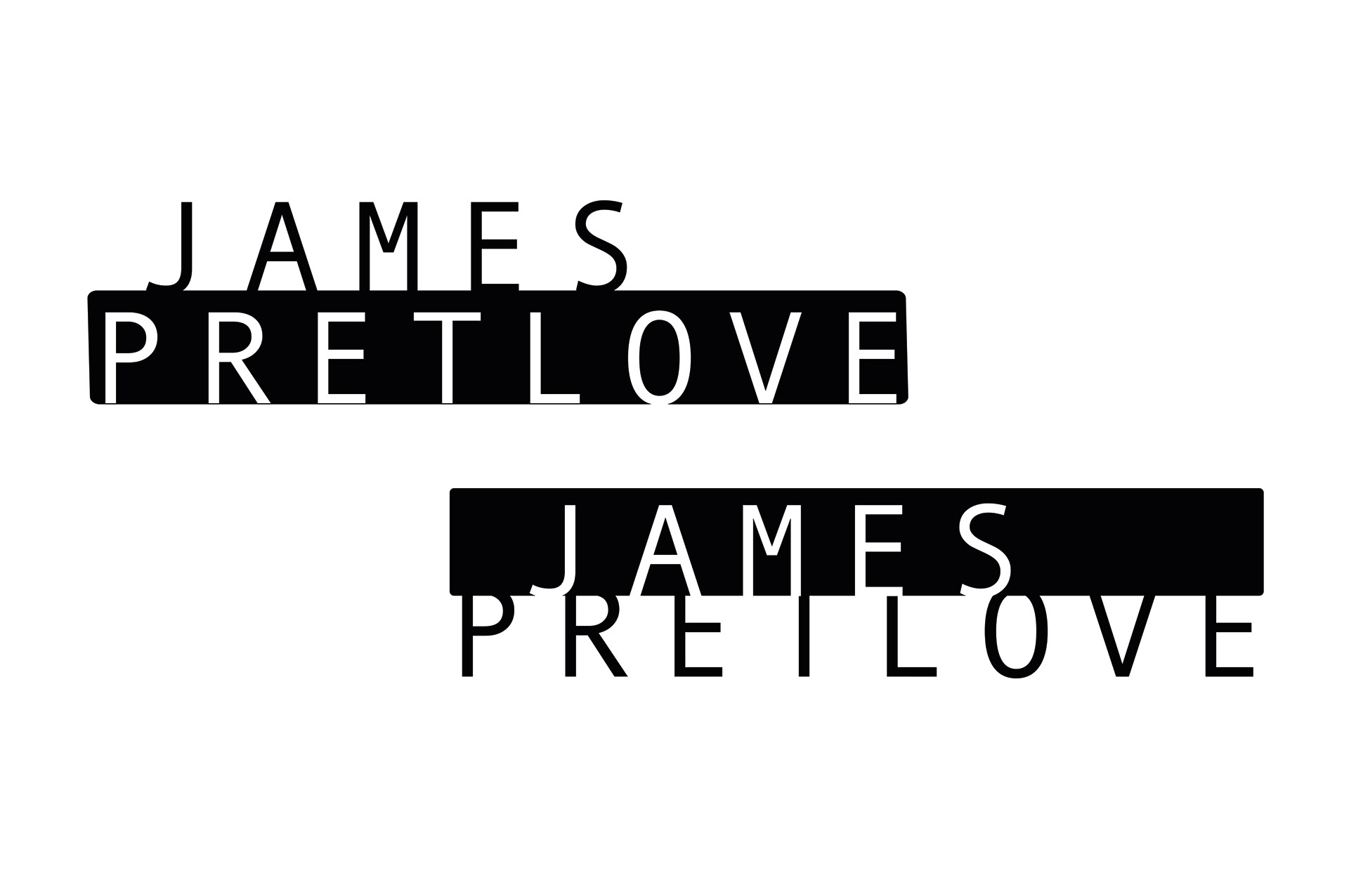
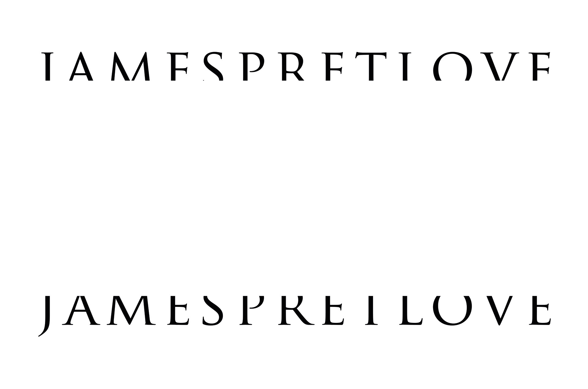

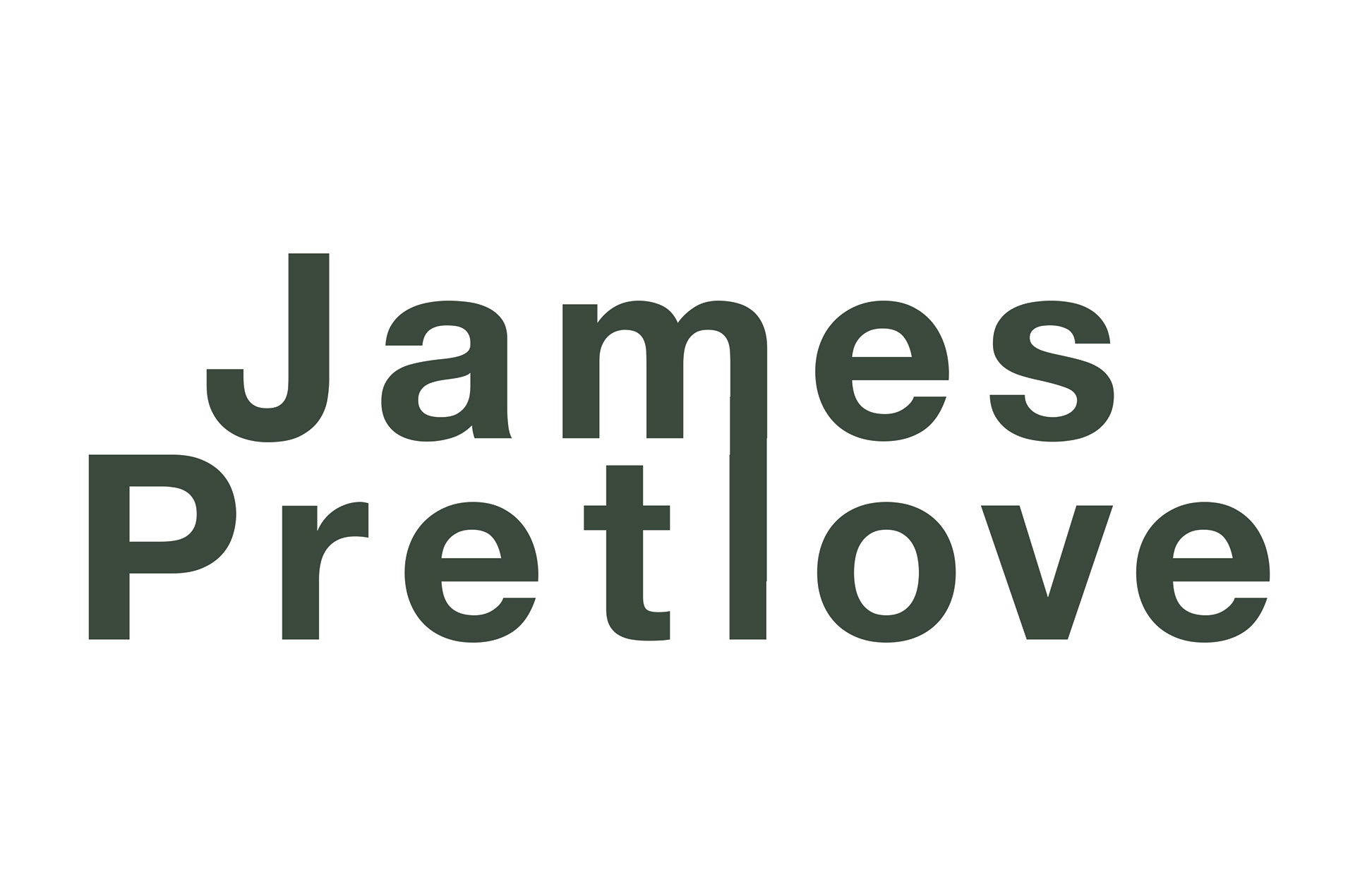
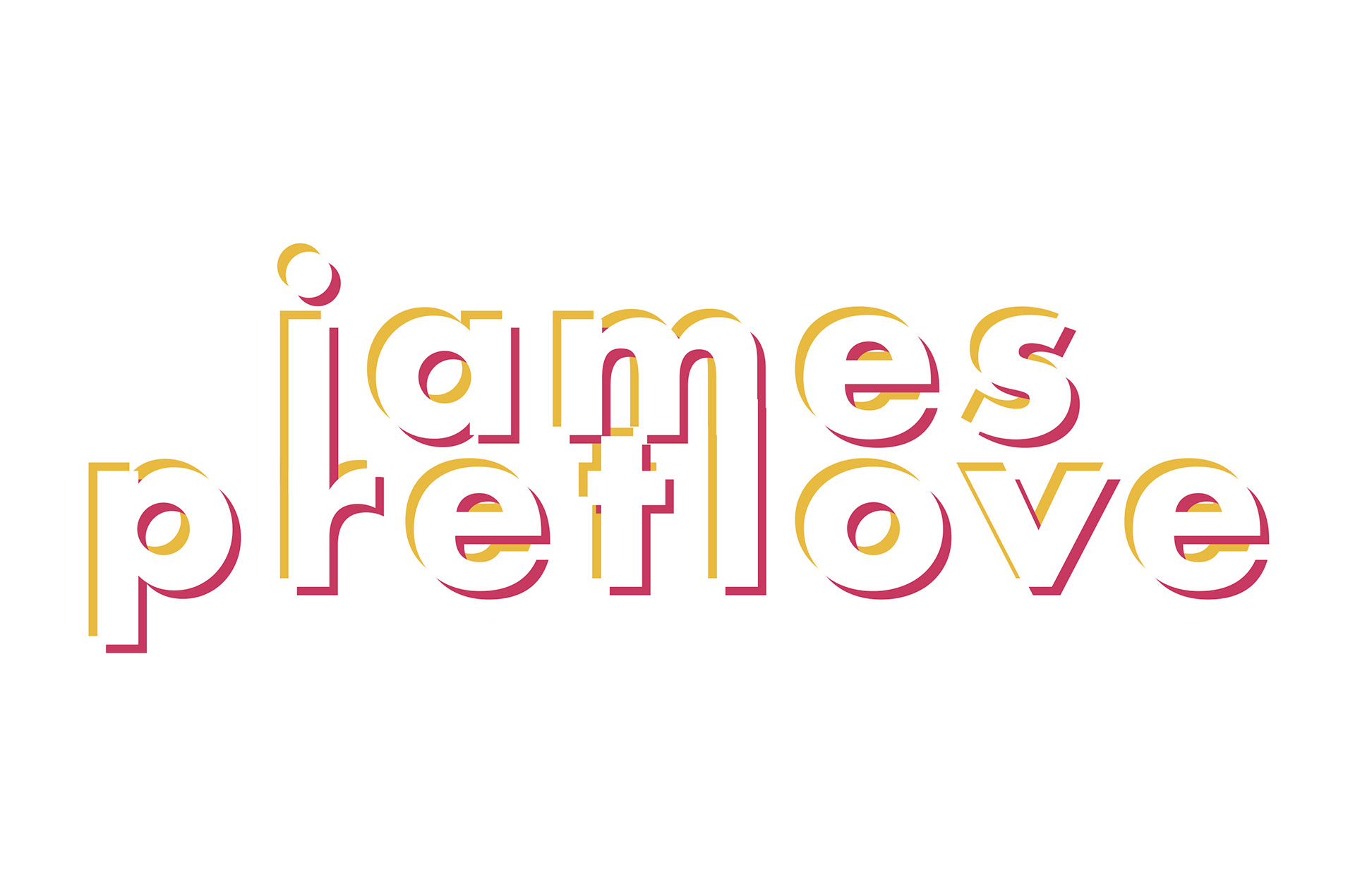
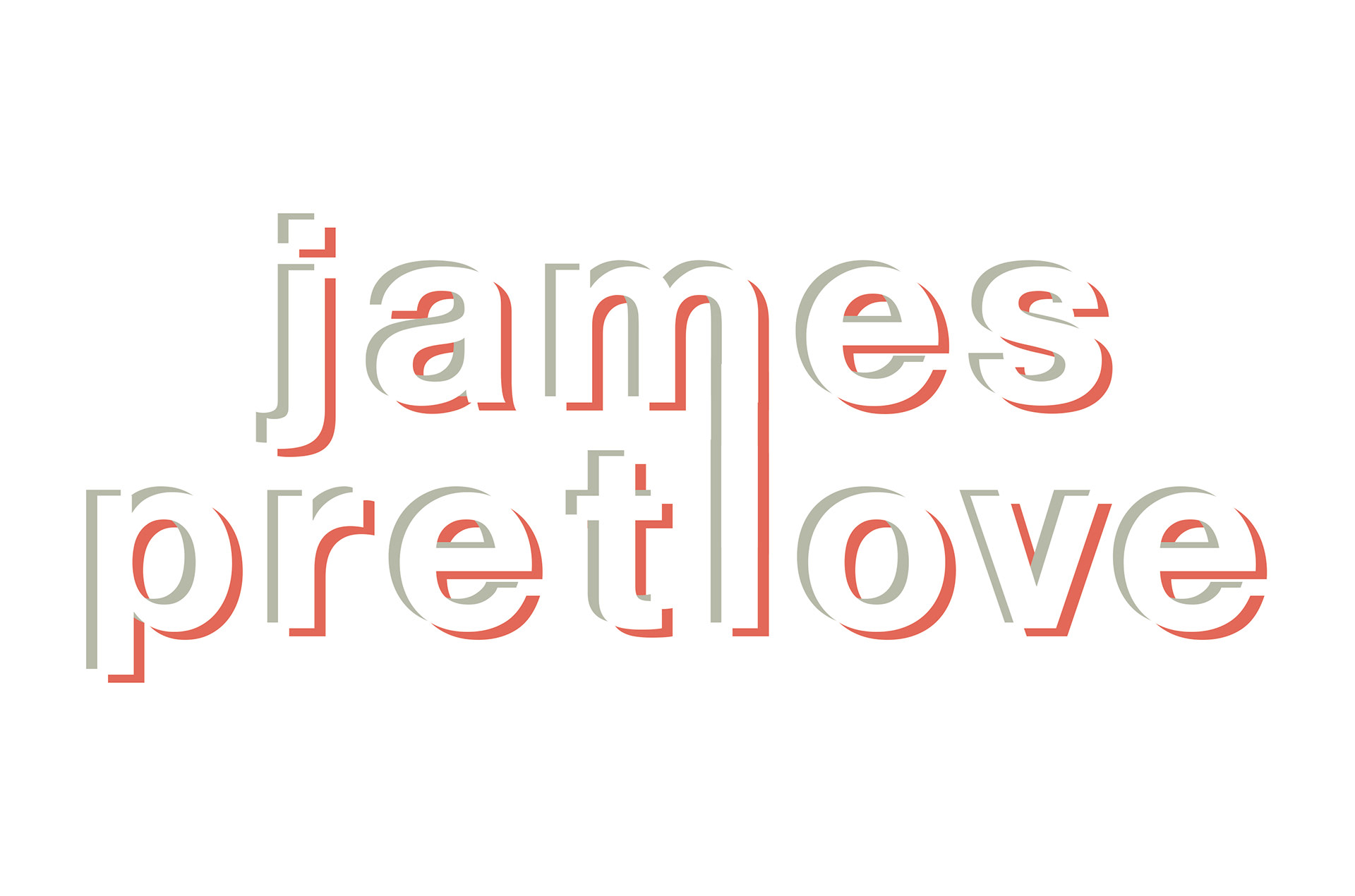
Above were my initial thoughts. James likes the idea of misaligned colour printing or the image produced by a faulty cathode ray tube. After playing with blurred fonts and Futura, we finally settled on a solid Helvetica.

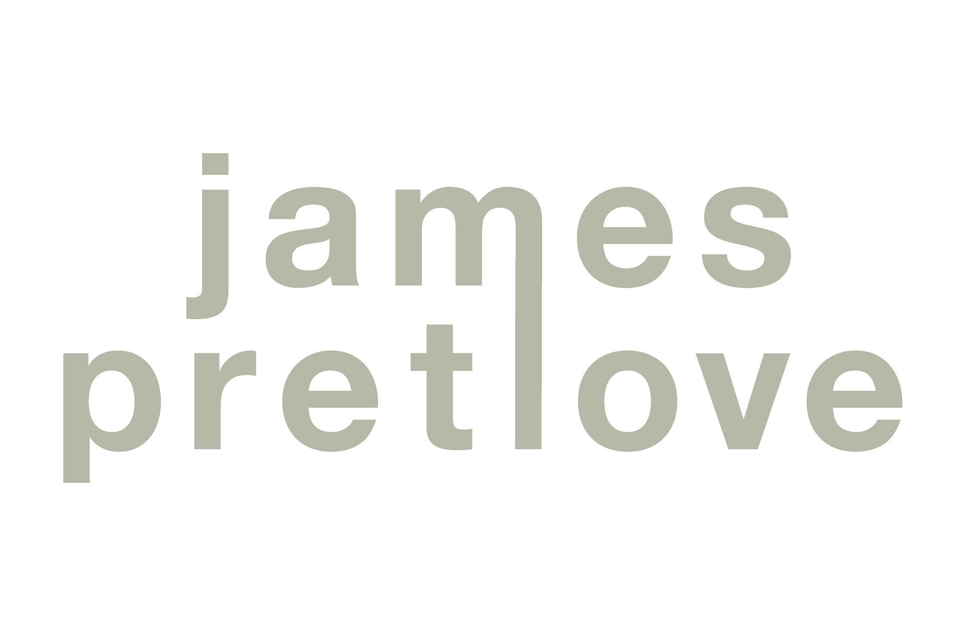
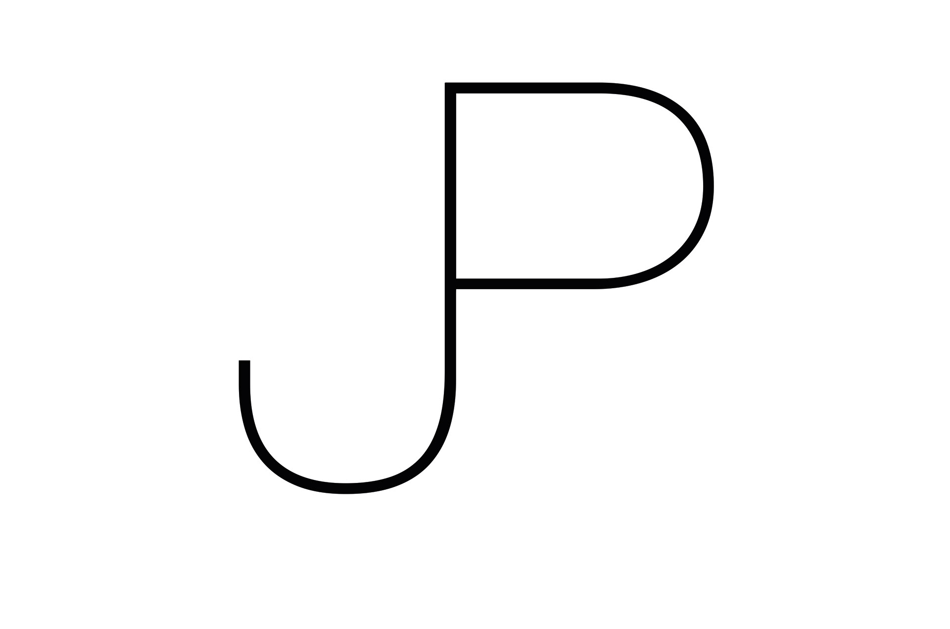
Below is the final logo, the choice of favicon and a page from the final site, jamespretlove.com